Aesthetics I

Retro

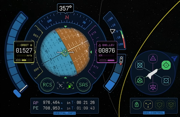
I wanted my site to stand out, and in viewing several examples, I thought KSP 2's new UI was a great source of inspiration. That old-ish internet theme combined with the pixelated font was so aesteically pleasing to me.


However, I saw several design conflictions. The high contrast text was great, but I felt like it was a little scattered with lots of icons and numbers. I took the retro style idea and tried to adapt it more to the philosophy of simplicity and for more text heavy content.
Nav

Screenshot of ksp 2 style

Source of inspiration - KSP 2

Aesthetics II

Interactives

To fit the theme, I also took the time to make adaptive elements that would convey my personality a little more.

These are mainly the stocks, github, and news headlines elements on the home screen.

Quality of Life

I also added some additional touches:

  • Parralax background
  • Slide in animations
  • Rain
  • "Glass" tiles
  • Neon effects

and the use of flexbox to allow for a wider range of screen devices.

Technicals I

Layout

I used a "header and boxes" layout, where each tile contains a distinct set of information. I felt like this was the best way to convey the information in a simple and easy to read way.

Caching/Preloading

To increase performance, I decrease rain with small screen sizes and mobile devices, and pre-load fonts and cache the results of the news articles and prices to prevent re-calling the slow endpoints.

You can see the saved results in F12 -> Application -> Local Storage.

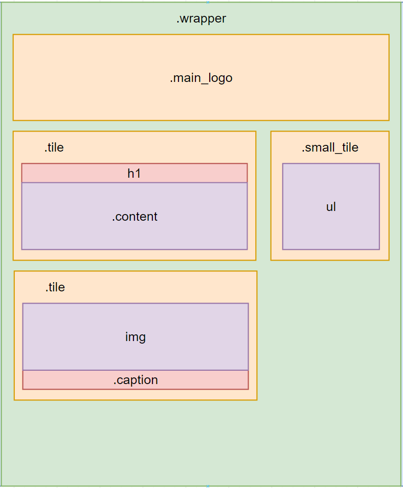
HTML layout of the page

HTML layout

Technicals II

Elements - Tile Specific

  • - .tile

    The main class to arrange the content within the screen, mainly for the dithering effect which is a tiled css background image of two offset pixel sized circles.
  • - animation: slide-in-left/right

    Used to slide the tiles into the screen via x-transforms on load in.
  • - .tile::before

    Allows for border effect on mouse hover. Takes mouse position and draws a circular radial gradient at mouse position.

Elements - Retro Specific

  • - html and body

    Changed to fill screen and also for centering the main screen.
  • - .main_logo

    Creates the style of the main text at the top of the screen through the use of various box shadows.
  • - .glow_box

    Also uses box shadows, but with a much larger blur. When combined with the solid border of each tile, it gives a neon effect. Similarly for glow_text.

Technicals III

Elements - Other

  • - .wrapper

    Creates the left and right borders around the tiles, centers the content to allow for easier reading, and uses flexbox to wrap and stretch the tiles to fit.
  • - .qrcode

    Unicode squares and spaces are not the same width, this class ensures the qr code is square. I used unicode as it allowed to easier experimentation with colors (svgs did not work for me, and I like the slight overlap effect anyways)
  • - table and ul

    Minor changes to fill the tile it is in. Used to represent the github and market elements as the row column structure fits the task well.

Elements - Special

  • - animation: rain

    Allows for the rain to fall from the top to bottom of the screen, designed to allow some javascript code to start it at a random position and then just repeat.
  • - .selectable:hover

    Allows for links to have a selected effect when hovered over.
  • - .background img

    Sticks the background image and fills the screen. The parallax effect is acheived with javascript events.
Lightout results showing no warnings

Lighthouse results

Accessibility

General

The accessability of my site was determined from the ground up. I built the html first and designed everything around it to allow for people to use it without css or javascript.


I used flexbox so that the tiles stretch and rearrange themeselves to whatever screen size the user has. This allows the content to be accessable to mobile devices as well as larger ones, tested up to 4k for both landscape and horizontal following WCAG 2.0.


Alt attributes and meta tags as well as general high contrast text and readable fonts for the content was used for people with visual impairments.


I had a blur filter, but quickly found bugs and low performance issues even in chrome, so that was swiftly removed. Apart from that, I was worried that the NES font may be hard to read, so I switch to courier for all text heavy boxes.

Accessibility

Motion

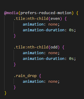
Because the tile animations on load and rain may be distracting to some users, I have used css "prefers-reduced-motion" to disable these features.


Users enable this though their operating system commonly under a "reduce animation" setting.

Browser support / Screen size

I have tested my site on all modern desktop chrome, edge, brave, firefox, opera and safari browsers with no issues.


Similarly, I can use any size screen from mobile to 4k, and without css/javascript/images (although it doesnt look as pretty).

CSS selector for disabling animations

Detecting motion settings

Accessibility

Other

I used flexbox in css to adaptively allow the tiles to fit the screen, which allows for a better small screen experience.

I also used image-rendering: pixelated for the background for a pixel art effect, which also allows for faster loading as the image can be smaller.

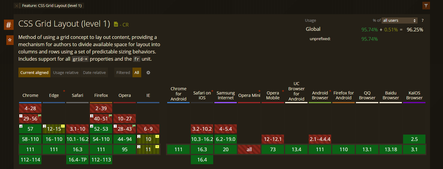
I also verified my page with jigsaw css validator with a full pass. and made sure that all css selectors were supported by the browsers I was targeting with caniuse.

Which browsers can support css grids

"CanIUse" css example

Personal Reflection

I am very happy with my design choices, a mix between the complexities of retro and the simplicities of tiles.

I wanted users to perceive the site as more of an art project than a wall of text, with "bits of personality" sticking though, with an emphasis on its readablity and "calmness". If I were to do it again, I would place more attention on the interactive elements and a more extensive background.

I hope you enjoyed my site! Be sure to check out my github and follow or give my projects a star!